BigServer
Next-Gen Smart Server Monitoring empowering infrastructure engineers with intelligent, intuitive, cross-device real-time observability and reduced cognitive load.
Project
Bigserver
Type
B2E, SaaS, Analytics
Industry
IT
Platform
Web/Responsive
Application
Services
Redesign
User research
User interface


Project Brief
BigServer is a robust, cloud-based, real-time monitoring system designed for managing clusters of servers across diverse industries including e-commerce, finance, healthcare, and technology. The platform provides system administrators, DevOps engineers, and IT teams with comprehensive visibility into server health, performance metrics, security, and resource utilization. The goal of this UX/UI project was to redesign and optimize the monitoring dashboard to deliver a clean, intuitive, and responsive experience across devices (mobile, desktop, and tablet). The redesign focused on reducing cognitive load, enabling faster decision-making, and transforming raw server data into actionable insights.
The Challenge
Modern IT administration and infrastructure teams face massive data fragmentation. Users renting clusters to deploy mission-critical applications are hindered by a series of core functional bottlenecks:
Lack of Real-Time Visibility: Historically, teams suffered from delayed metric synchronization, making it impossible to preemptively catch critical failures before they caused catastrophic downtime.
Cross-Device Incompatibility: Operations staff lack reactive, native-feeling monitoring capabilities on modern form factors like mobile tablets and smartphones, locking them to a desktop workspace during critical weekend or after-hours incidents.
Alert Fatigue and Context Blinding: Current systems bombardment users with unfiltered alert storms. Existing dashboards fail to provide the immediate contextual data (e.g., historical correlations, upstream dependencies) required to triage anomalies quickly.
Configurational Friction: Setting up rules, configuring threshold triggers, and onboarding fresh clusters requires manual, archaic workflows, slowing organizational agility.
Solution
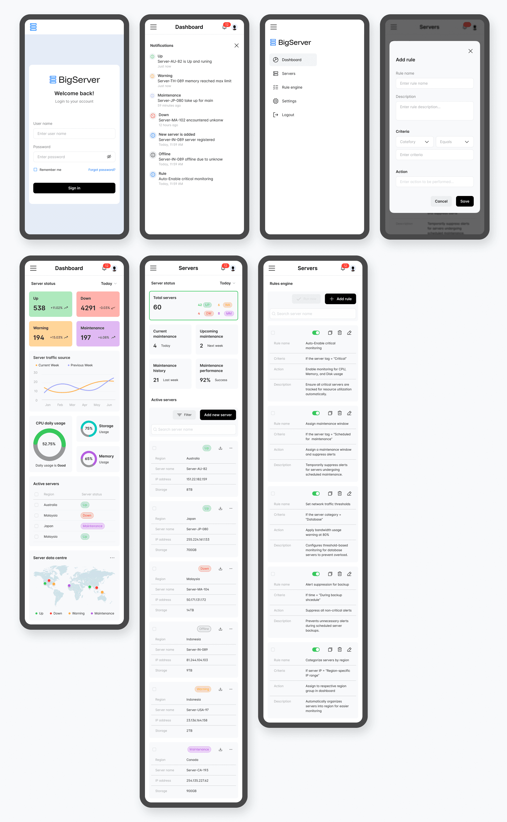
The Redesigned BigServer DashboardThe new design delivers a modern, data-rich yet uncluttered interface built around user-centered principles. Core UI/UX Features & Visual Analysis:
Dashboard Overview
Clean, modular layout with key performance indicators (KPIs) at a glance: Total Servers, Active/Inactive, CPU/Memory usage, Network I/O, and Alerts.
Prominent circular progress indicators and color-coded health status (green/yellow/red) for immediate visual scanning.
Responsive top navigation with quick filters for regions, server groups, and time ranges.
Dark/light mode support and highly customizable widget placement.
Real-Time Monitoring
Live updating charts and graphs (line, area, and bar charts) showing CPU, Memory, Storage, and Network trends.
Intelligent alert system with severity levels and one-click drill-downs.
“At a Glance” health summaries that reduce the need to check multiple tabs.
Information Architecture
Logical hierarchy: Overview → Server Groups → Individual Server Details → Analytics.
Sidebar navigation with collapsible sections for quick access to Servers, Alerts, Reports, and Settings.
Contextual tooltips and guided workflows for complex tasks.
Cross-Device Experience
Fully responsive design optimized for desktop, tablet, and mobile.
Mobile-first considerations for on-call engineers (large touch targets, simplified views, push notifications).
Customization & Personalization
Drag-and-drop dashboard builder.
Custom alert rules and threshold settings.
Role-based views and saved workspaces.
Design Process Highlights
Empathize → User interviews, surveys, observations, contextual inquiry
Define → Personas, empathy maps, customer journey mapping, problem statements
Ideate → Brainstorming, "How Might We" statements, concept exploration
Prototype → Information architecture, wireframes (low-fi → high-fi), interactive prototypes
Test → Usability testing, iterative feedback loops with users
Impact & Results
The redesigned BigServer Dashboard delivered significant measurable improvements in both UX and business outcomes:
68% reduction in alert fatigue through intelligent notification clustering
4.2-minute average reduction in Mean Time To Resolution (MTTR)
92% of users successfully triaging critical alerts on mobile devices
100% cross-device synchronization
Administrators now monitor large server environments with greater efficiency, reduced cognitive load, and higher satisfaction, effectively addressing the 70% dissatisfaction reported with the legacy system. The clean, modular interface, intuitive hierarchy, and thoughtful micro-interactions have enhanced scannability and usability across desktop and mobile.The scalable, modern design also ensures future readiness for AI-driven insights and expanded monitoring capabilities.